Dr. Lex' Website History
Version 1 - Version 2 - Version 3 - Hosting - Other Sites by Dr. Lex
Version 1
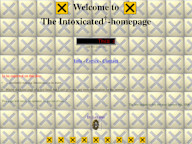
The very first main page of this site was first uploaded on January 28, 1997. It was a typical “starting webmaster's” page from that time, meaning a huge incoherent vertically oriented pile-up of graphics and text. The “Microwave Canary” was already present on it, which makes it one of the oldest parts of this site.
One thing that has struck me recently is that many a ‘modern’ website is using a design that closely mimics this horrendous first attempt of mine at making a website: long vertically scrolling pages where finding specific content is as awful as finding a particular track on a cassette tape. Of course modern websites have much more polished graphics but still it makes me wonder where the heck the internet is heading.
Below is a collection of parts that were part of the huge mess that was once the home page, including its background image.
  
The old title logo, and some of the uncountable irritating animated GIFs, like the ubiquitous rotating “nuclear” symbol. Of course, like many other ‘webmasters’ from those days, I cared more about fancy backgrounds than readability of the text. |
|
 Coop Doughnuts. A reference to Twin Peaks, which gives you an idea how old the first main page was. |
 Sergeant Kotzpuw. If you don't know what that means, ask someone who speaks Dutch. The image was taken from the ‘Kid Paddle’ comics by Midam. Later on he would be renamed to ‘Kotzkwijl’ in the Dutch translation of the comics, or Placid Sulfurik, similar to his name in the original French editions. |
 This is the famous Easter Chicken, created during boring Latin lessons back in 1993 and re-mastered to this Special Edition in 1997. |
 The poor guy in this image was a maths teacher at the time the first home page was made. The few people who remember him, might also remember this. |
Version 2
On April 9, 1997, I uploaded the first major revision of the site, which attempted to be a little more structured. The messy ‘catch-all’ homepage was replaced by a cool looking ‘interface’ which linked to separate pages. It took a whole day to draw the home page and another day to make it work. I even made a special ‘Christmas edition’ covered with snow. This second version stayed here until October 2, 1998. This is what it looked like:

|
     
|
    |
|
Version 3
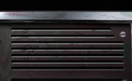
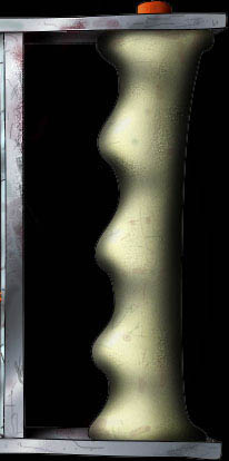
The third iteration replaced the previous one on October 2, 1998. The site itself was again cleaned up, and the main page was completely redesigned. The idea was to make it more modular so parts could be added or changed, but in practice this has hardly happened because it was still cumbersome to modify the image and clickable maps. This image took even longer to make, it is a combination of some rendered 3D graphics and hand-made (or rather mouse-made) drawings in Photoshop. Unlike the previous version, this one has lasted a whopping 10 years. The display at the top right was animated and reacted to mouse movements. It is disabled here by default, but you can enable it if you wish. This whole thing relies on ‘hover’ triggers, so don't expect anything interesting if you are viewing this on a touchscreen device. Most of the links still work, by the way.
 |
    |
  |
    |
![]()
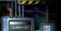
The ‘calibration’ button took you to a page containing the above image (still available in the random archive). It allowed to set the brightness and contrast on your CRT monitor to decent values, which was not self-evident back then. For some more nostalgia, the info page stated that the minimum requirements to view the site properly, were a PC with at least 110 MHz and a 16-bit colour monitor with 800x600 pixels. Most smartphones nowadays easily surpass those requirements.

This image, which is actually a tiny ray-traced 3D animation, was at the bottom of each page, and linked back to the main page. It took a while before I realised that moving stuff below text could become pretty annoying fast.
Some statistics for the nerds: the first main page took 360 KiBytes in total, due to all the piled-up junk. Of course, with the dial-up speeds which were common at that time, this made it take awfully long to load. The second home page took 180 KiB and the third one only 130 KiB.
Hosting
Until January 16, 2001, the site had always been located on a server of my university (www.student.kuleuven.ac.be), but then I moved the site to a “Belgacom.net” account because it offered more space and the possibility existed that I would leave the university (which did not happen as I started another master and a PhD). Unfortunately Belgacom closed all access to their FTP server in September 2001, except for their dial-in users. Because it wasn't quite practical to boot up my modem and spice up the telephone bill each time I wanted to update the site, I moved it again, this time to a F2S (Freedom2Surf) account. This was a remnant of the first dot com bubble, one of the last real free webspace providers, and the quality of the hosting was excellent. Alas, at the end of 2001 they also announced that they would end their free hosting services.
I then moved to ‘F2G’ for a short time, which was run by Portland. This was also for free, but the servers were full so often and the speed was so disastrous that at the end of 2001, I finally decided to move to paid hosting.
I found a very good deal at 34SP.com. Of course it was not for free but the value for money is very good. Although I am no longer a customer of theirs, I still recommend them for their fantastic service.
In March 2008, 34SP changed their free domain names from “*.34sp.com” to something I didn't really like, so I finally went for my own domain name and registered the “dr-lex.be” domain at Stone Internet Services (who are now absorbed into EasyHost.be).
In November 2019, I decided to take things in my own hands and moved the website to a VPS hosted by Combell's OpenStack cloud. This should make it more responsive than with the shared hosting it previously relied on, and of course it also gives me full control (at the cost of having to do everything myself).
Here is a list of URLs where this site has existed in the past, in case you want to dig up the old versions in the Internet Archive. Unfortunately some snapshots may consist of mostly ‘403 forbidden’ pages due to an overly aggressive security module.
- http://urc1.cc.kuleuven.ac.be/~m9608615/
- http://www.student.kuleuven.ac.be/~m9608615/
- http://www.drlex.f2s.com/
- http://www.drlex.f2g.net/
- http://www.dr-lex.34sp.com/
- http://www.dr-lex.be/
Other Sites by Dr. Lex
The Official Intoxicated Site: Although the (very) local Belgian band “Intoxicated” (not to be confused with the American band with the same name) has been dead for a long time, their ‘official’ site still exists as a kind of relic. Unlike the other sites below which have all vanished, this one has survived because it is hosted as part of this very website. Nothing has changed about it since it was abandoned on January 9th, 1998, so don't expect something really exciting unless you get a kick out of typical mid-nineties website “design”…
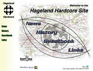
The Hageland Hardcore Site: Although Hardcore and Punkrock may only be a small side-corner of my musical taste, this site was dedicated to some bands playing these styles, from the “Hageland” area in Belgium. It was started in May 1997 and initially served as the website from ‘PN’ (formerly Portie Nootjes). Especially the guestbook became a favourite meeting-place for a lot of young people, actually it became more like a message board than a guestbook. With the advent of the ‘Funtime’ site and its forum, the popularity of the HH site started to decline. It was decommissioned in February 2007.
Archive URLs: http://urc1.cc.kuleuven.ac.be/~m9621324/, http://www.hageland.34sp.com/
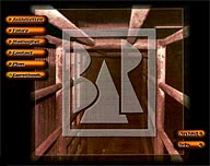
De Bar: This was the website of the youth center of the “Diependaal” residential quarter in Herent, Belgium. As I didn't have the time to maintain it, around 2002 it was replaced by a new site with a rather ugly WinXP-look. The original site remained online for several years until f2g finally moved it to the trash.
Archive URL: http://debar.f2g.net
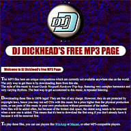
DJ Dickhead's Free MP3 page: This site has been obliterated somewhere in 2000 because of too few visitors, and because Tripod.com liked to delete accounts at random. This site was nothing more than a kind of decoy to see how many people got on the page, and how (it was tracked by a few extended stat counters). The page did contain free mp3 files and looked professional at first sight, but as you may guess by the name of the fictitious “DJ,” the music (described as Avant Garde Neopunk Hardcore Trip-hop
) was horrendous, actually it was an attempt to create the most repulsive sounding noise which could still be classified under the name “music.” Surprisingly, the site had thousands of hits during its first months, but after a year the number of visitors suddenly dropped to almost zero, most likely because either the word about the repulsive noise had spread around the world, or because search engines started to filter out anything looking like a site offering illegal MP3's — yet the page was 100% legal!
Archive URL: http://members.tripod.com/djdickhead/index.html
If you would want to get a taste of that Avant Garde Neopunk Hardcore Trip-hop, I still have the MP3 files and am willing to send them to anyone masochistic enough to want to listen to them.
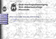
Oud-leerlingenvereniging Sint-Albertuscollege Haasrode: The site of the alumni (former students) union of my former high school. (This site was in Dutch only.) At a certain point in time the union got into a passive state and so did the site. I lost access to it after May 2008, but it kept on running by itself until it was finally removed during a redesign of the school's entire website. This must have happened somewhere after March 2016 according to the most recent archive I can find.
Archive URL: http://www.salco-haasrode.be/~olv/

Elek2002 Site: The official site for the electrical engineering students of graduation year 2002 at the K.U. Leuven. (This site was in Dutch only.) This was maintained by a small team of people and I had made the design, with the typical scrolling digital display in a jumbo edition (due to the way crawlers work, in the archive you'll only see the letters for the word ‘initializing’ though).
Archive URL: http://elek2002.vtk.be/
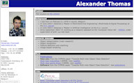
My PhD student webpage: This was a simple ‘about me’ page from the time when I was doing a PhD and some post-doctoral research at the K.U. Leuven. The page disappeared when I left the university in 2011. Most of the things that were available on that page, are now in their own section on this website.
I also hosted the ‘Nerd-ad’ collection there, which I revived at the end of 2019.
Archive URL: http://homes.esat.kuleuven.be/~athomas/
